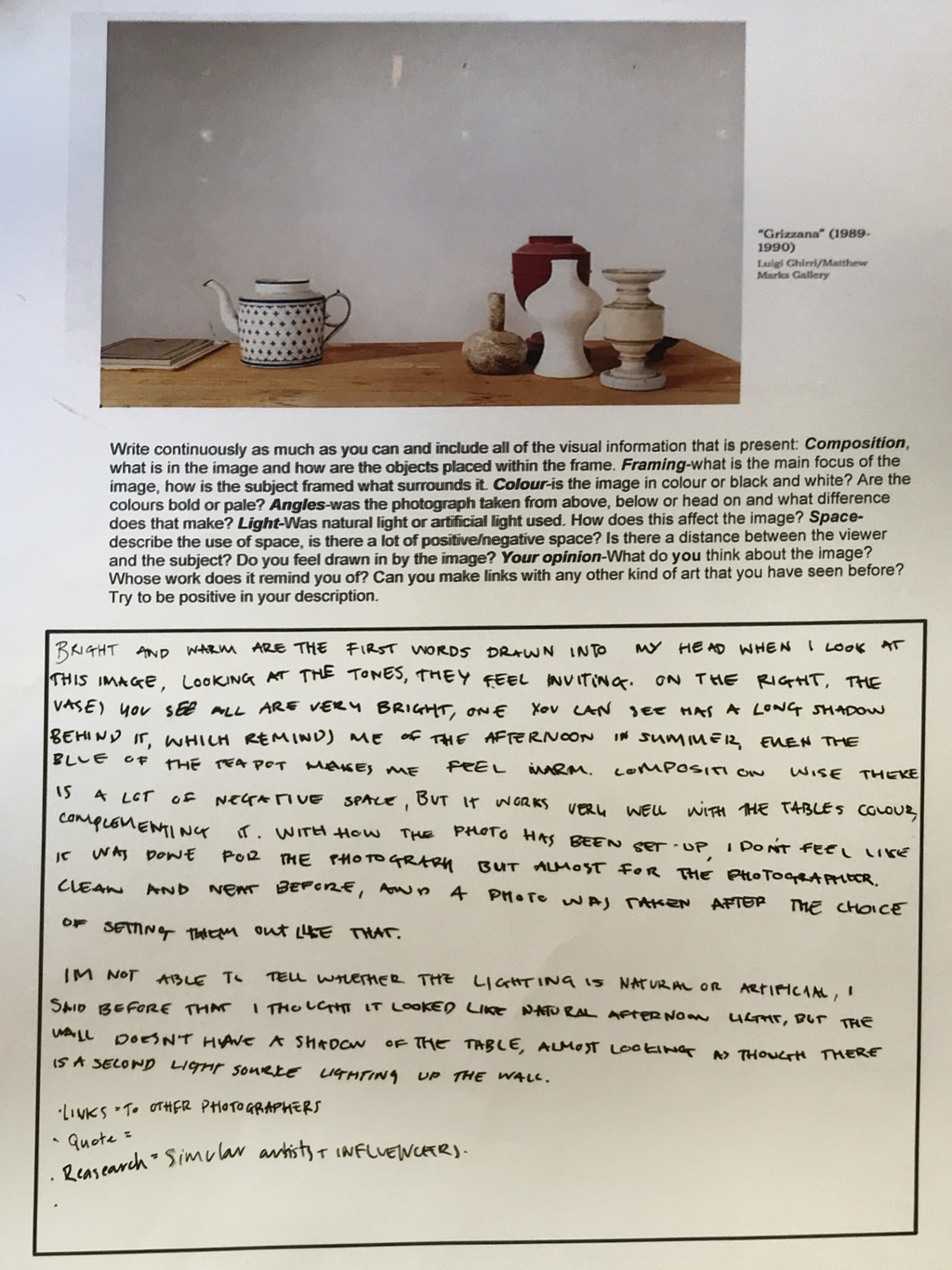
|
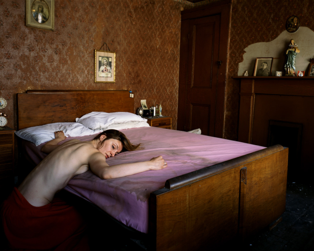
Death of Coltelli by Tom Hunter
|
LIGHT : The lighting in this image has such a wide range of levels, what I mean by this is that there is so much light in some ares of the image and yet hardly any in others. For example the subjects forearm and face are lit up very clearly, getting all the tones of pink and cream in her face, but if you look at the subjects waist, there is a maroon/dark red towel that is shrouded in darkness and is difficult to see, even though the actual colour could be very vibrant. As well as this you can see some negative space in the image caused by the low levels of light, down by the foot of the bed and through the doorway, however it does give an aspect of mystery to the image, allowing us to get enticed by the scene even more. The light in the image looks as though it is natural light, it isn't harsh, and yet isn't too soft, as well as it being defused across most of the image, most likely coming in through a window out of shot. The walls of the room across from where the window would be do reflect some of this light, helping give the brown walls a bit of a shine, as the texture is very boring, much like what you would think of in a very old persons house.
FRAMING : The framing of the image isn't what you, as a viewer, would notice first, however the more you look into it the more you can notice about the image. First of the image cuts off a lot of object .ie. the clock on the left side of the bed, the framed picture of the virgin Mary in the upper left hand corer, as well as showing a small corner of the ceiling in the top of the image. All of these small details, show that the main focus of the image is the subject, and less so their surroundings. As well as this it looks as if Hunter had to sit in the corner of the room to fit the subject in, so it is not that they would of cropped these features out intentionally, but rather to pull the main focus of the image further to the viewer, these crops would had to have been done. You can also see that if you bring the rule of thirds into the photograph, it goes against it. The subject isn't in the centre of the image but rather off to the side, and yet we still know she is the main focus.
SPACE : You can see that in the image the space is used as much or as well as it can be. What I mean by this is that it looks as if the photo was taken from the corner of the room, showing there wouldn't have been a huge amount of space for the subject to be to be in the photo, however it was used well as we still get the main message of the woman on the bed and we are able to see the majority of her surroundings. As well as this there is negative space at the end of the bed, crating an new aspect of mysterious tension in the photo, contrasting the golden framed religious photo and skin tones in the woman.
COMPOSITION : The composition of the image looks again like the space, as if it was done that was as that was best out of limited options, but from limited options a great photo was taken. The woman is the main subject of the photo and we are able to tell this through the composition, as well as have the scene well lit by the position on the image and how the objects of the room all face towards the woman.
COLOUR : You can see that the colours of the photo vary widely, there is the mundane colours of the walls and the some of the religious decorations, compared to the colours of the woman's towel and the bed sheets. Having both of these groups of colours (the dark and light) helps create more tones in the image, as well as texture and depth. Having the photo taken in this room with the brown walls and religious nic-nacs rather then a room with white walls and family photos gives quite a mysterious and creepy vibe, allowing us to get drawn into the image even more.
FOCUS : Straight out for me the focus of this image is the woman lying on the bed and the bed itself. Because of the vibrant colours that are lit up by the natural light, contrasting the shadowed areas of the photo. As well as the colours of the bed and the woman, the more you look at the photo the more you notice the lights showing patterns on the wall and how rich the brown is, or the gold frames and the religious nik-naks on the walls, all of them being subtle in the way they help the image have the feel it does.
|
What can you see in this photograph?
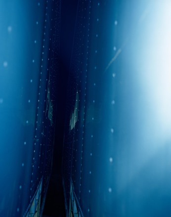
Two objects very close to one another, they look like walls or the sides of boats/trucks. The light looks as if it has come from camera flash, bouncing off the blue walls creating the blue tinge of the image. What type of photography is this? It's hard to put a name on his style of photography, but I would ho with abstract or observational. How is space described? You can see that the image is slightly off centre of the frame, and everything is slightly rotated, this gives the impression that the photo wasn't too thought about, like the photographer walked past and took the photo on a whim. How has the photographer dealt with light and colour? Much like Eileen Quinlan's work, the photography focuses on colour, however like I said in the third question, the photo looks like it was taken as a spur of the moment photograph, the colour and light there for being used unintentionally. |


Peter Fraser
|
Fraser is a British photographer, born in 1953 and first got a camera at the age of 7. He studied Photography at Manchester Polytechnic between 1972 and 1976. He as a photographer seems to work a lot with the idea of artificial light but does also branch out into natural. Objects over people, he ins't usually one to photograph a face, you can see in the photographs below, his photos seem to be him viewing his surroundings, taking photos of things as they are, only using light to change how they look. I personally have a hate love relationship with his work, some of his photographs standing out to me so much, and others I will find boring and mundane. One aspect of his photography I do like is that he seems to add pops of colour to his photographs, for example the first three images below are all photos that consist of brown/beige background colours, and then an object that has a bright vibrant colour, like the blue buckets or red berries.
|


|
|
|
|
This is a film that Peter Fraser is inspired by, the main premise of the video being that everything is made up of very small things. We start at a couple in Chicago having a picnic, and move away from them 10x the distance we were originally, and the same again and agin, until we are at the furthest reaches of our own universe, then we even go 10x closer towards the couple, getting all the way inside a nucleus. Peter Fraser said himself that "Everything in the universe is made up of small things, so small things are critical to why and how the universe actually exists. I think small things are the key, they're the absolute key to everything."
|
|
|


|
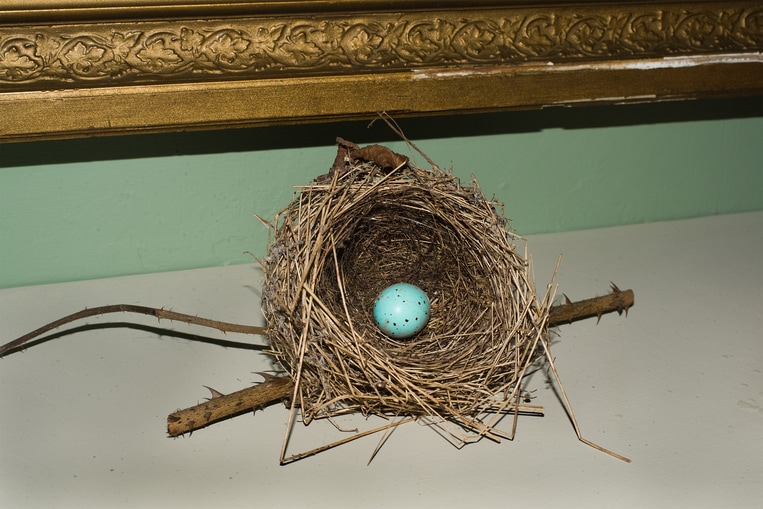
This image by Fraser is one that, though I am not a huge fan of, I admire the skill of and find very interesting. First off the colours of the image seem very subtly complimentary, for example the off-white of the table works well with the colour of the wall, as well as the nest and the golden frame working together, even though all the colours are being slightly washed out by the flash, they still working together very well. Then you see the egg in the nest, right in the centre of the image that is a bright blue colour, drawing us in. Secondly you can see that the lines of the image all follow the same direction, the frame and the stick , as well as the table all following the same direction, all these details, even being as small as the leafs on the frame being similar to the theme of the nest with natural forms, but the lines of the twigs working in conjunction with the geometric nature of the other objects. All of this almost impossible to see without giving the image some thought.
|
|
|


|
|
These two are the images that I took that I though related to Peter Fraser's work the most, using the flash in the first one to get a very artificial, light source, which almost changed the texture of the photo all together, as well as the fact that it is focusing on one single object in the photo which can usually be overlooked.
- How do you notice the small things?
- What is your camera of choice?
- What photo that you have taken do you like the most?
|
|
|


When I look back through my evaluation on Peter Fraser's work, I feel as if I have judged his work quickly, you can see above I have put in my notes from the talk wit h Fraser and some more of his photographs, and after seeing some of the photos he showed us and listening to him talk about his work my opinion on his style has changed. There are still multiple photos of his that I don't like, however I have found some I do like and I appreciate his work more now because of it. The early work of his photographing landscapes is one I find captivating, which I would never have known about if not for his talk that we saw.
Roland Barthes 'Camera Lucida'
What causes the author's "amazement" when looking at a portrait of Napoleon's brother?
Because of the fact that the eyes he is looking into have seen Napoleon, "I am looking at eyes that eyes that looked at the emperor".
What is the first thing the author discovers about photography that makes it seem special?
"What the photograph reproduces to infinity has occurred only once: the Photograph mechanically repeats what could never be repeated existentially."
What does the author notice about the special relationships in photography of the signifier (the photograph) and the referent (the subject)?
Gallery Visits
         |
Serpentine Galleries
The Grayson Perry exhibition in the Serpentine was incredibly inspiring, his unique style matching his mad personality. One piece of art that I very much enjoyed was the KateBoard Skateboard, a skateboard with Kate Winslet on the base, with a pink and gold colour scheme, the design being captivating. As well as this there were many tapestries on the walls that you could stare at for hours, all political based, with jokes and anecdotes, always something new to see. |
|
The Saatchi Gallery
The selfie exhibition at the Saatchi galley was probably my favourite exhibition, based on such a simple idea some of the collections of photographs were incredibly interesting. One piece 'miss fotojapon' by Juan Pablo Echeverri, he took a passport style photograph of himself everyday, however what caught my eye was the incredible bright colours and the fashion in the photographs. As well as this there were intractable pieces of art, some of which you can see in the photographs to the left, all of these creating a more memorable experience. |
             |
|
|
Tate Modern
The Tate Modern was the last gallery I visited over the summer, and whilst walking around passing through different exhibitions, I stumbled across a piece of Stephen Shore called American Surfaces. Even from a distance it caught my eye, the layout of the photographs on the wall, all symmetrical in white frames, with photographs you had to get up close and personal with to properly view. I also noticed the more I views them that my style of photography was very similar, the style of capturing moments, traveling round, and a very key element of my love of vibrant colours in photography. |


Summer photographs


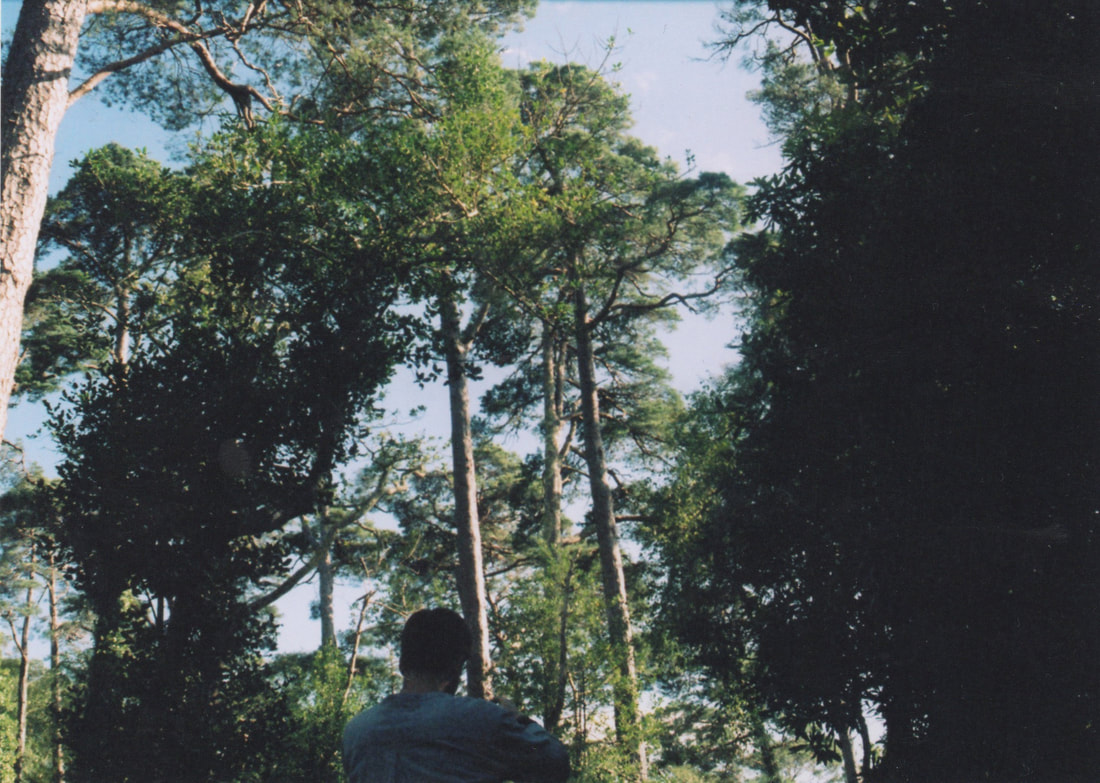
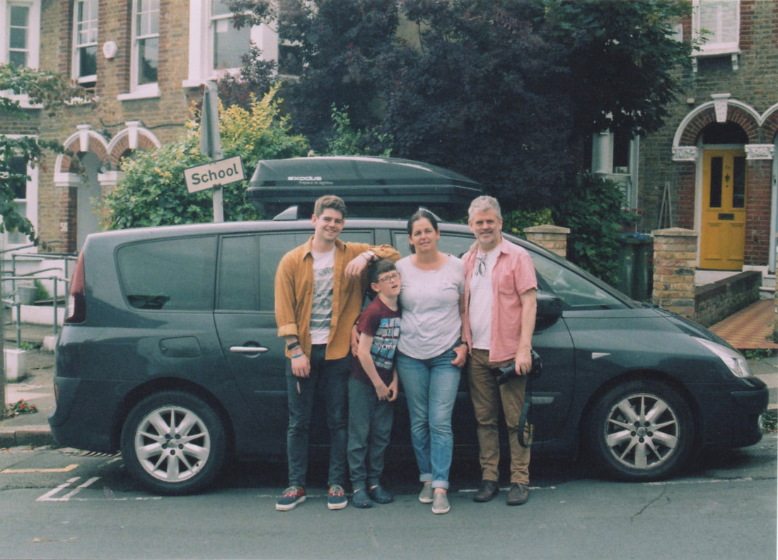
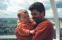
Over the summer I took some photos on my phone and she on a stills camera. The ones you can see above are the ones that were t`ken on my phone, and the main purpose of them was to capture moments I wanted to remember, for example the photograph of the taps in the bar, are from a night out in a pub in an area of Dublin Called Dalkey, watching an up-beat blues concert. Where as the photograph of my brother in the water is from when we stumbled across a small crystal blue water beach, on an Island off the coast of West Cork. And though all of them aren't amazing photos, more of my purpose of documenting, all of these photos being for my please, but the photos taken on film, were thought out to be for a public view.


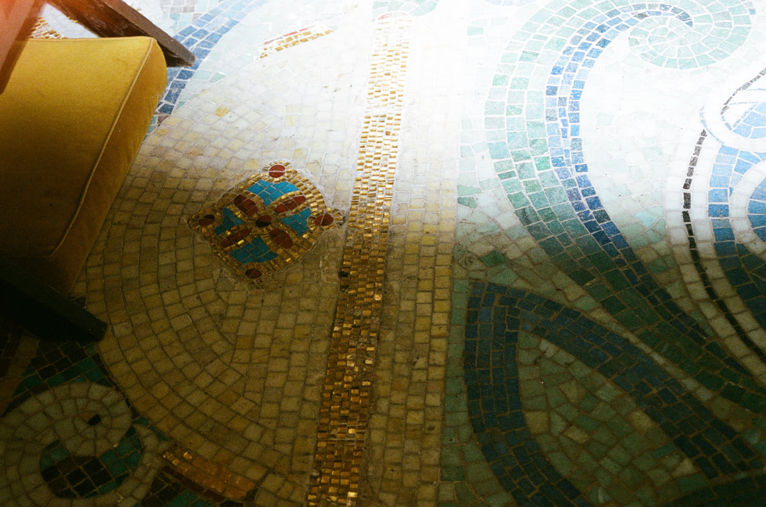


These photographs were all taken on film, and though I do like some of them, others I am not a huge fan of. Working with film is both a very exciting thing but worrying thing as you focus more on the area your in and what photos you will take, however they could be terrible in the outcome.
|

|
|
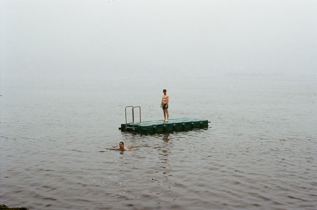
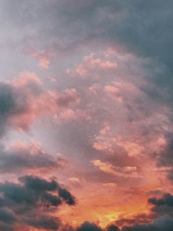
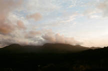
The two photos above are two I took that I like a lot, the mist in the first one makes it very mysterious, enticing, whats beyond the fog, as well as the colour scheme being cold, harsh, giving a very dramatic look. The photograph next to that I also like, it being warm, and creating a sense of wanderlust, the sky being almost gold, but the valley covered in darkness.
However the photograph to the right, isn't one I like at all, the lighting wasn't what I thought it would be, as well as the image coming out incredibly grainy, Adding on to this, the colour is almost sickly, non-consistent, and I find that annoying. |

|


|
Wolfgang Tillmans
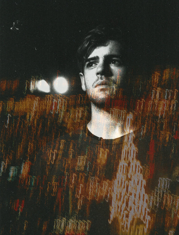
An artist of which whom I have been looking into more recently is Wolfgang Tillmans. The German photographer is somebody who's work I admire, not only his photography but his activism also, however I cannot put my finger on what his style is, none the less I am in awe of it. down below you can see what I mean by his style,I love the fact he doesn't have one defined style, or if he does, that I can't see it, I'm constantly exploring, |
You can see to the left a group of images, these are a group of images of his that really catch my eye, two of which a portraits. I love the fact that they aren't just photographs of people, there is something different about them. For example in one of the images there is a photo of a boy that has an image of some lights and water droplets on a window on top of it in a lower opacity.
|


|
|
These are two photos that I have in response to some of Wolfgang Tillmans' work seen above, the first photograph is a portrait with a secondary photograph of a city skyline placed on top of it with the opacity turned down. Both of the photographs were taken with a stills camera on film; you can see some scratches and dust that were on the photos when I got them developed, but I actually really like the photo, it's creative and different, the city skyline making it more interesting to look at, I also played around with changing the colour of the lights to colours such as red, pink and blue but overall I preferred the golden lights the best. The second photo was one I took on my phone as a spur of the moment thing, the sky was golden with the sun set, however I did some editing to make the colours in the sky both a little more vibrant and warmer, as well as adding some grain to add a bit of texture. I am quite pleased with the result, it definitely would of looked better if it had been taken on a camera, but for what I was able to catch on my phone I am happy, the composition and grain in the photo are features I am especially happy with.
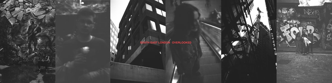
This is a series of photographs from a black and white roll of film that I overlooked after getting it developed. You can see above that some of them are blurry, very faded, the contrast is very high, they aren't the best on the roll so I overlooked them, and I decided to put them together to see how they would look, you can also see that I have added some red text, I added this because I want to experiment more with text and photographs together.
|
|
These are some more experiments of putting words and pictures together, different colours of text, different sizes and their competition, where the letters go on the photo and whether they are on and off the picture (like the example of the left). I would have to say that the photos down below with the white text are the ones I prefer, they also look more like a Wolfgangs Tillman piece. The white text stands out on the photograph more, the only downside being that if I print the pictures on a white t-shirt, it means that I won't be able to push the words half off the image as the white text won't show on a white t-shirt. But the photographs below are my favourite, and not only that but I believe that those there work very well as a series, all on film, all with similar warm yellows (one of my favourite colours).
|


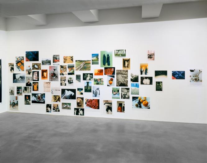
For Installations
The problem with using t-shirts as a canvas for my photos is that it limits the type of median I can use when I would like to explore more into the different types of printing, as well as it would be harder to convey the idea of family I want to get across. I had a look at some installations of different photographers to pull inspiration form each one, as I could involve more prints and styles in my installation. For example the photo bellow is an installation by one of my favourite photographers, Wolfgang Tillmans, and though it is very simple I think it works really well, the colours in his work usually stick to a strong theme of being very bold and the texture working in harmony to create a smooth feel to his photos. Though it is very simple, I think the different sizes of the prints make it much more interesting to look at, like having levels in a theatre performance, it adds something to grab your attention quietly.
The problem with using t-shirts as a canvas for my photos is that it limits the type of median I can use when I would like to explore more into the different types of printing, as well as it would be harder to convey the idea of family I want to get across. I had a look at some installations of different photographers to pull inspiration form each one, as I could involve more prints and styles in my installation. For example the photo bellow is an installation by one of my favourite photographers, Wolfgang Tillmans, and though it is very simple I think it works really well, the colours in his work usually stick to a strong theme of being very bold and the texture working in harmony to create a smooth feel to his photos. Though it is very simple, I think the different sizes of the prints make it much more interesting to look at, like having levels in a theatre performance, it adds something to grab your attention quietly.
|
The layout of the images was obviously thought about, I think that have pints in the centre all compact and then dispersing more as they move from the centre, like the right hand side has three prints in a row on their own, showing to the density going down. with the sizing of the prints, it looks as if they are a rage from A4 or a bit smaller to A2, and they go all the way to the ground, so I would guess the size of the collage in height goes quite high up, really making you stand back to take it all in as one piece.
|


|
I went to the Tate Modern to try and get some inspiration for large prints displayed, and I found this Daidō Moriyama exhibition. First off the large prints were amazing, the size of them somehow made them very daunting, the provoking style working with the size to seem threatening with some images and yet others feel very intimate. Secondly I loved seeing the diverse range of sizes of prints, which is something that I would like to incorporate into my installation, having very large photos and then some that you have to get close up to to see, creating a more intimate experience. But the thing I found the most interesting is the projection of his photos on one of the walls, and I had this idea before with old family videos but to add in photos to the installation with the projector is anther idea of displaying photos.
|
|
|
|
|
|
|
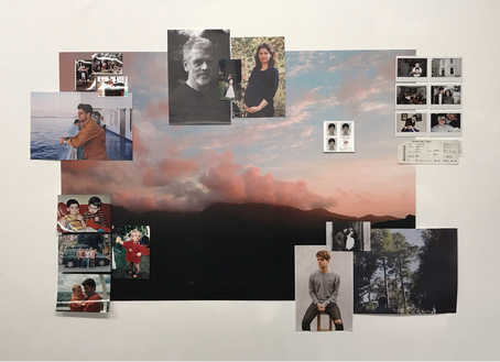
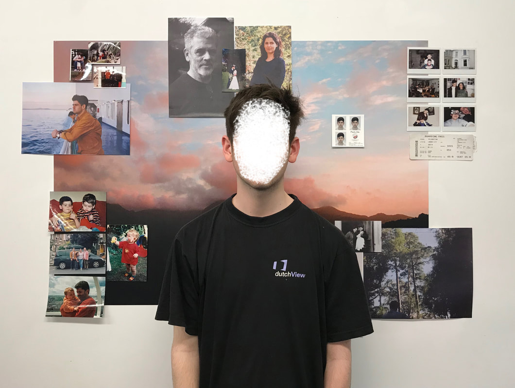
This is a photo of my first attempt at the installation, on photo of just the installation and one with me in in so that you could see the size of the installation. I like the way it is looking so far, the way all the colours blend in together, the left side being very warm colours and the right being colder but the main photo being a combination of both. As well as this the size is something I really like, the mixture of all the different sizes, the small ones you have to get up close and personal with and the bigger ones that make an impact from a distance. Next though I do want to move the photos out of the print more, spread it across the wall more so that the installation is bigger as well as adding a bit of moving image to the installation, so having a film projected over the wall, so one clip over the whole wall and then some in certain areas of the installation.
|
I then tried to expand my photographs to make the piece bigger, adding some more prints that were a3, and moving them off the large a0 photo, to make this taller looking piece. Much like showing prints together like WolfGang Tillmans does, I
I feel as though mine has a different element to it, with the scale of it, the hight rather then the width, and though it was done without though, now that I do stand back and think about it, its almost as though it was made to be a piece that you had to get up close and personal with, stand right up against it and look up at the work, be intimate with it to make sure you can see all of what is going on. |


